How To Convert Visitors Into Customers

Image Credit : Wikipedia
Building an online business can be an exhilarating and terrifying task, but so is watching a kid grow, building a house or learning to ride a bike. The early stages of watching your business grow can be daunting if you're new to the process, but as it is said “Success necessitates sacrifice.”
After getting your website to rank on the first page of Google and attracting social media attention, you need to convert visitors into customers and subsequently turn your website into a profitable online business.
What that means - is that you have a way of turning website visitors into money.
Here’s how to convert your visitors into customers:
1.) Speed - Make Your Website Load Quickly
Time is a valuable resource, therefore it's better to do things as quickly as possible. The same goes for the web, where speed has a huge impact on conversion rates. Put simply - the faster your website loads, the better your conversion rate, which in turn keeps a visitor interested and stop's them hitting the “back” button before they’ve even given you a chance.
Your website should be able to load under three seconds, but if you can make it load much quicker than this then that’s a real bonus.
One way to increase your site speed is using Google's PageSpeed. It is a free program by Google that can help you increase page load thereby, decreasing your load time.
You can also test the speed of your site in a number of places, including your browser’s incognito/private mode and online using GT Metrix, Pingdom and many others. The advantage with the online sites is that you get a full breakdown of which elements load when (known as a “waterfall”) and they’ll also suggest improvements you can make.
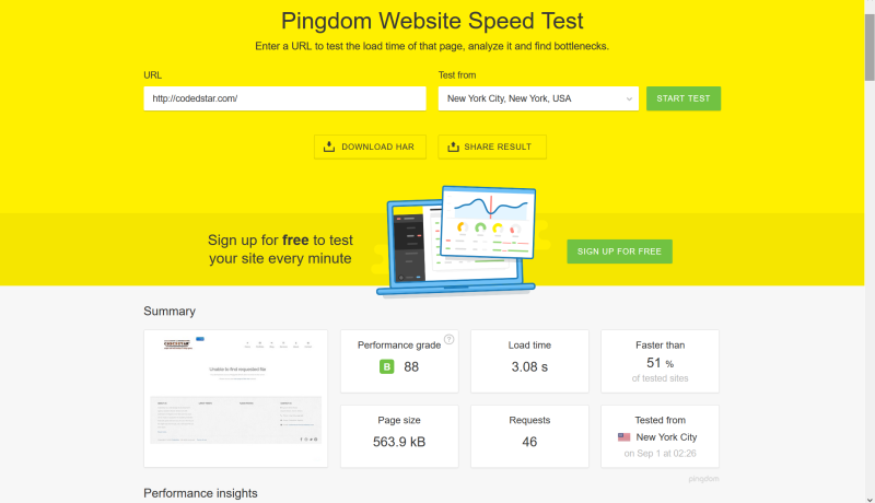
2.) Smart CTA - Place Call to Action Buttons Strategically
As much as you might not like hearing the word “Strategically”, it is actually important to be strategic in placing your call to action (buttons) on your website. In other words, you have to make obvious what you would like visitors to do and this is referred to as the - “call to action”.
You create a workflow and use your smart CTA to guide visitor's through navigating your website, or finding out more about your business. Most commonly used CTA's include - “View our products”, “Get in touch”, “Find out more” or “Talk to us today”; it could be anything you want, depending on your website.
Use bright or contrasting colors to attract attention and encourage clicks. You should avoid colors associated with danger but still get you CTA's to stand out from the rest of the site.
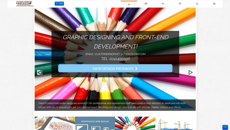
codedstar has a clear Call To Action
3.) Focus -Optimize the Landing Page
It is important that you emphasis want you want visitors to know about your business.
Writing a great headline is a bit of an art and you might you have to practice a little to get it right. In as much as you will be having the urge to show visitors everything that you do within a second of landing on your home page - don't, as it can lead to confusion.
Think of a one-liner, and make it bold and obvious.
“We have the best appliances”
“We take care of your car”
“Lower Prices You Can Trust”
"Your number one online store"
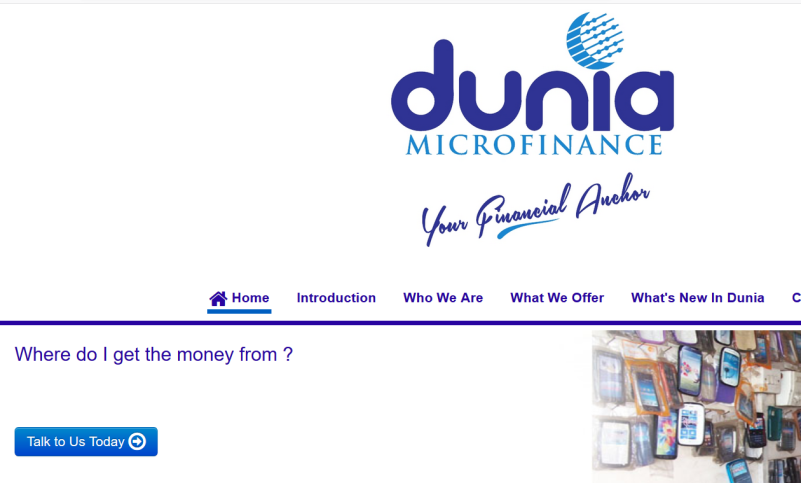
Dunia's site lay clear emphasis on services that is being offered.
4.) Trust - Earn Trust with Social Proof/Case Studies/Testimonials
Most visitors are not going to make a return visit to your site to see what you’ve been up to – unless you have something really cool going on.They might follow you on your social media accounts so they can be kept silently up to date with news from your company. Add buttons that link to your social media and keep your feeds up to date, try not to be offensive and avoid contents that would lead to inappropriate, abusive or hate speeches. Make use of official recognizable logos on these buttons to display your social media links distinctly. Highlight new additions to your website and communicate them effectively on your social media channels.
Use case studies to break down exactly what you did to help your visitors achieve their results. You might have to integrate testimonials within the case studies to back up the claims you are making.
Make sure your testimonials are authentic and descriptive. Spray your testimonials across your website and especially on pages that impact sales.
5.) Do More - Bandwagon Effect/Logo Porn
The bandwagon effect is referred to as the tendency for people to adopt a certain behavior, style, or attitude simply because everyone else is doing it. The more people that adopt a particular trend, the more likely it is that other people will also hop on the bandwagon. This is also known as the - Herd Mentality.
If you have a signup form for instance, and you want to increase your signups, you can show how many people have recently signed up or are currently using your product or service. This would encourage more visitors to stay and in turn increase your conversion rate.
Logo porn is a lineup or organization of some well-known companies logo that you have worked with, affiliated to or recommended by. Logo porn is after all not what you thought it was, gotcha' 
Chances are you might have seen it before, so if you have a logo porn you might as well showcase it.
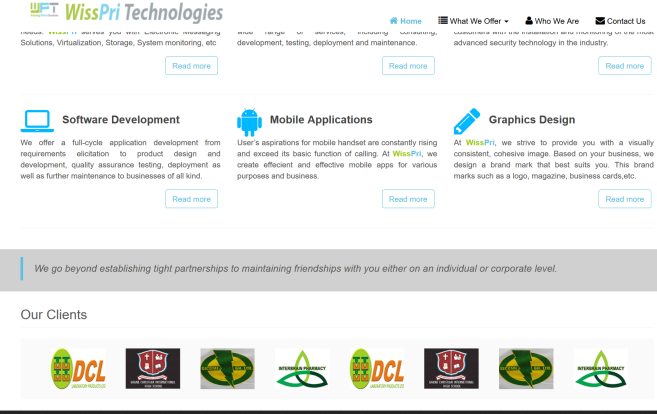
Logo porn from wisspri tech
6.) Mobile - Ensure your Site Works on Mobile
A lot of visitors view your website on a mobile device than they do on a traditional laptop or desktop. It is therefore important to make sure it loads quickly and works well on mobile devices. You can make custom tailored adjustments depending on the device being used, example - making your site show a “Click to contact” button on a desktop, but show a “Click to call” button on a phone.
You can use Google’s Mobile Friendly Test – as well as your own real-world testing – to see how your website behaves on a phone. Contact your web developer if it’s not acting the way you would want - on a phone or tablet.
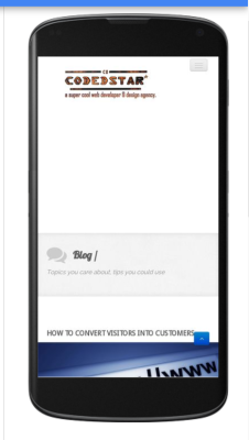
codedstar has been optimized for mobile viewing.
7.) Contact - Simple Contact/Live Chat
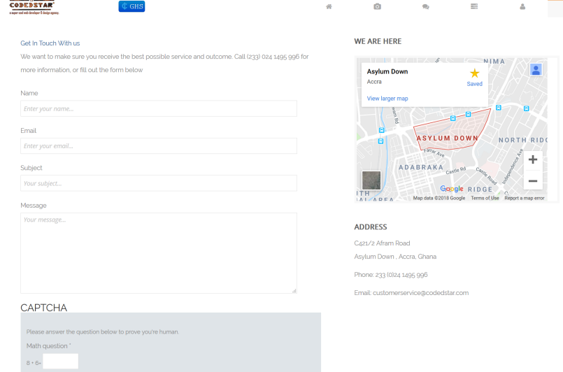
Display your contact details clearly, there is no reason why you it should be difficult for people to get in touch with you.
Another alternative is a live chat function, some visitors are more comfortable with a live chat session and you could gain their trust in a matter of seconds.
There are many ways to set up a live chat on your website. One of the most popular systems is Tawk.to – a free messaging app that lets you monitor and chat with visitors on your website, mobile app or from a free customizable page.
Drift is another conversational marketing platform, it transforms your marketing with real-time one-on-one conversations and chatbots that qualify leads and books meetings for you.
8.) Conclusion - Time is Money
If you have been patient and read on up till this point, why not ensure that your efforts are paying off by turning your website visitors into customers?
You can go through this post again to see if you can use some of the tips mentioned to boost your conversion rate and turn that exhilaration into satisfaction.
Don’t be afraid to try to find out where your new business is coming from and who your new visitors are. Then focus more on that area.
If you have experience any other method(s) or have any tip(s) you want to share, please leave a message.